对于Google Reader的新UI我都懒的吐槽了,反正现在Google的服务在小上网本上全线扒窝,能有一半的屏幕用来显示内容就不错了,剩下一片白,亮瞎我的狗眼。
别的就算了,Google Reader天天要用的,而且还找不到更好的,在考虑newsblur,但貌似有点慢。所以想办法通过修改User CSS,至少让Google Reader显示内容的空间大一点。
/*Read*/
.read .entry-container .entry-title a {
color: #333333 !important;
}
.read .entry-container .entry-body a {
color: #2244BB !important;
}

/*Unread*/
.entry-container .entry-title a, .entry-container .entry-body a {
color: #2244BB !important;
}

/*Subscription Section*/
#lhn-add-subscription-section {
height: 37px !important;
}

/*Viewer Header*/
#viewer-header {
height: 37px !important;
}

/*Top Bar*/
#top-bar {
height: 35px !important;
}

/*Search Field*/
#search {
padding-bottom: 3px !important;
padding-top: 3px !important;
}

/*Item Outline*/
.card {
border-right-style: solid !important;
padding-right: 1em !important;
}
很简单的CSS,好吧,其实是我不会复杂的。也没有javascript,因为我也不会,羞。
界面布局都没动,只是把未读条目的颜色改回原来的蓝色,把顶上的大白条给弄细些,然后把选中条目的那个框右边给补齐。
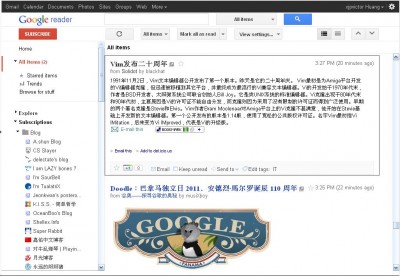
看看图吧。list视图

Expand视图

Update:在网上看到有人也做了一个CSS,而且做得更彻底,完全像原版的了。链接:http://www.v2ex.com/t/20606